A UI design explainer for B2B non-techies
What is user interface design and how does it affect your B2B website experience? Learn the basics with simple tips from a Motum B2B web designer.

What is good user interface (UI) design? When a site just “works.”
Besides the dozens of hours dedicated to programming and content development, building a website with excellent user experience (UX) requires knowledge of human psychology translated into sophisticated web design.

It’s not just about looking pretty. UI design is about knowing what visual cues invite users to do things like click buttons, enter text into a field, or find your products — and what frustrates them enough to make them leave a website.
UI design has a massive impact on first impressions. Visitors can form an impression of a website in 50 milliseconds, and 94% of users notice the look-and-feel of a site before deciding whether they will continue to navigate it or move on.
Despite all the complexity, the result of good UI is pretty simple.
“Good UX/UI goes unnoticed, because as the user you get to do exactly what you’re trying to do,” says Ben Reimer, Web Developer at Motum B2B. “You find what you need right away, the information is clear, and the functionality is intuitive. It follows patterns you’re familiar with, so it feels like it just works.”
What do we mean by UI design?
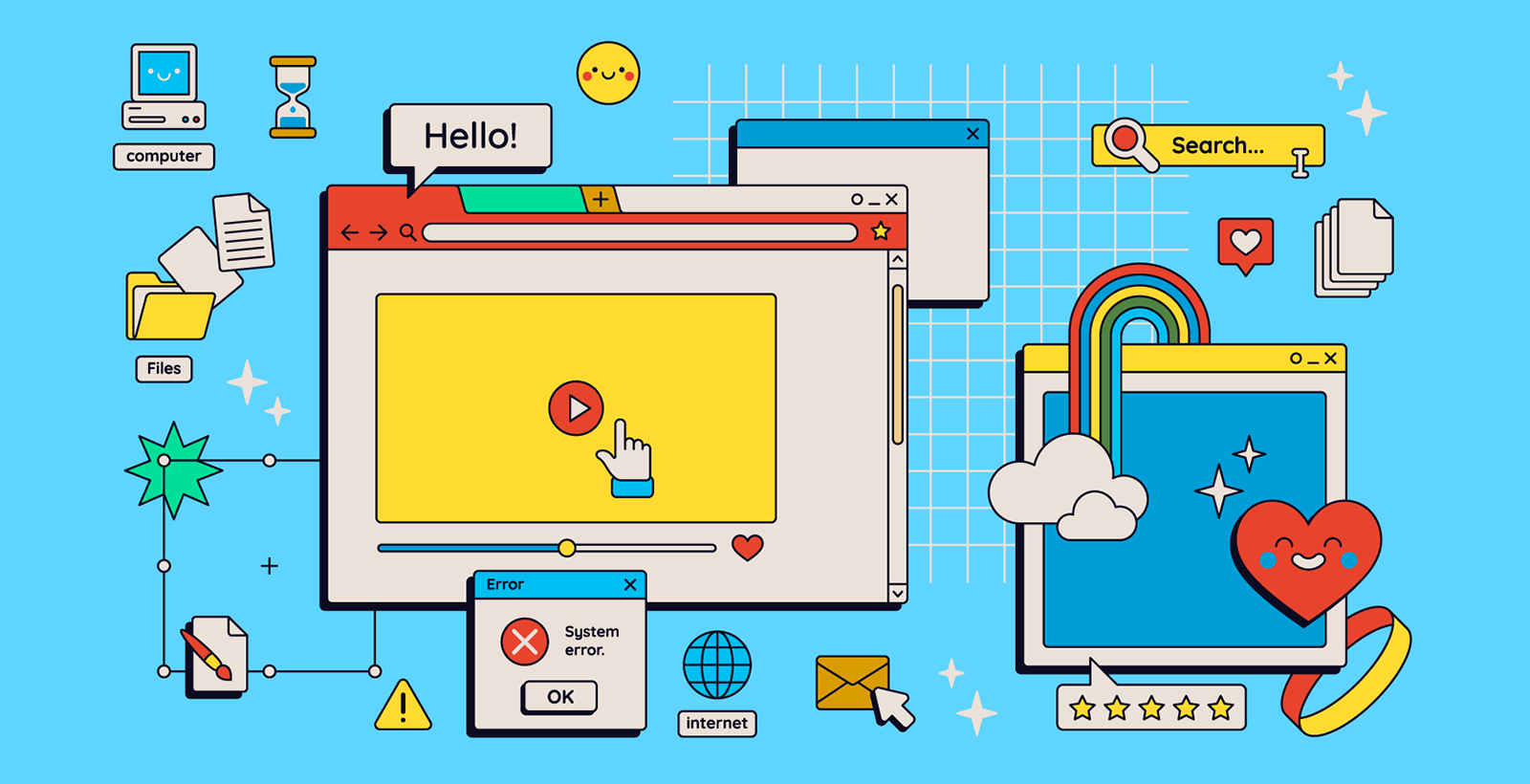
The user interface is everything you see and interact with on a website. UI design is about making a clear visual path to help visitors get around.
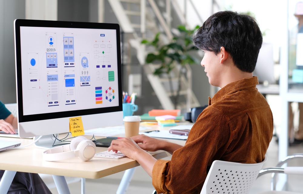
“UI design is interested in questions like, ‘How do I lay out this page to be visually appealing and easy to navigate?’” Reimer says. “’How do I make this section pop more?’ ‘How can I lay out the content so it matches the brand guidelines?’ That’s all related to UI design.”
Here are some examples of UI elements, which we’ll cover in more depth next month:
- Buttons
- Navigation menus
- Forms
- Call-to-action blocks
- Cards
- Accordions
- Tooltips
- Carousels
Good UI is a critical part of helping B2B website users reach their goals, whether it’s contacting a representative, comparing products, requesting samples, or finding technical information. If users can’t easily reach their goals, they won’t stick around and keep trying.
What could go wrong?
As fellow B2B professionals, it’s safe to say we’ve all encountered websites that look like they came through a portal from 1995, bringing with them cramped text, eye-jolting colour schemes, and a healthy sprinkling of Comic Sans.
Users should never have to hunt for a contact button. Ben Reimer, Web Developer at Motum B2B
B2B is not a beauty contest, but design matters. The reason we’re off-put by these websites is because poor design choices make them confusing, frustrating, and generally difficult to use.
Bad UI design also presents several risks.
What if a user can’t find the contact button to get in touch with you? What if the contact form is too complicated? What if your business’ most important information is overshadowed by a distracting visual scheme? What if there’s no clear way to reach content they want to see, like a datasheet or product page?
In cases like these, users won’t find what they need, and they usually won’t stick around to troubleshoot the problem.
“User confusion quickly turns into frustration,” Reimer says. “Unless they have a high motivation to use your site, that frustration will reach a threshold and they’ll leave.”
That could even mean moving on to your competitor’s site without returning to yours. Research shows 88% of users are unlikely to return to a site after a bad experience.
On the flipside, a Forrester study says every dollar invested in UX can result in a $100 return.
Components of good UI
Reimer says a correct visual hierarchy is integral to good UI and UX. “Your eye is drawn to the most important things first and the least important things last,” he explains. “There are all sorts of design tricks to change the visual hierarchy on the page.”

Accessibility is another important consideration — regardless of their abilities, all users should be able to navigate a website by the means available to them.
Websites with a strong UI also have an easy, sensible navigation system with a logical structure, as well as buttons, links, and form inputs that have a “clickable” look to them.
“Buttons are critical to get right. There have been trends where styles are simplified so that links are just text and there is no visual indicator you can click them. That is a pretty critical problem for interacting with a website,” Reimer says, adding that the web design pendulum is now swinging back to create more intuitive interactions.
What’s UI-critical in B2B?
Call-to-action blocks, buttons, and forms are Reimer’s top three most important UI elements to get right in B2B websites.
“B2B conversions are more about starting a conversation than adding things to a shopping cart, so having a great contact form is very important. The form should be clear with the right fields on it,” he says. “Then, to draw users to that form, you need call-to-action blocks or buttons around the site.”
These UI elements should be designed to make it as easy as possible for people to get in touch when they feel ready. “Users should never have to hunt for a contact button,” Reimer adds.
Once the user is finished inputting their information into a contact form, they must know where to click to submit the form to your reps. That often means a strong background colour and bold text on the submit button.
Context is important too. Let’s say your submit button has another right next to it that lets users clear the form fields and start over. “You want users to be able to do that, but that’s a less important action, so you might make this button smaller and grey,” Reimer explains. “You’re using size, colour, and font weight to change the visual hierarchy.”
Though B2B websites can be beautiful, they don’t need to be fancy or flashy to offer an intuitive experience to users. By helping users achieve their goals quickly and seamlessly, great UI design also boosts your website’s potential as a sales tool.
Want to learn more about UI elements? Check out Part 2 of our UI design series.
