UI in action: Learn the most popular elements
What are these common user interface (UI) elements, and how do they help users find what they need on your B2B website?
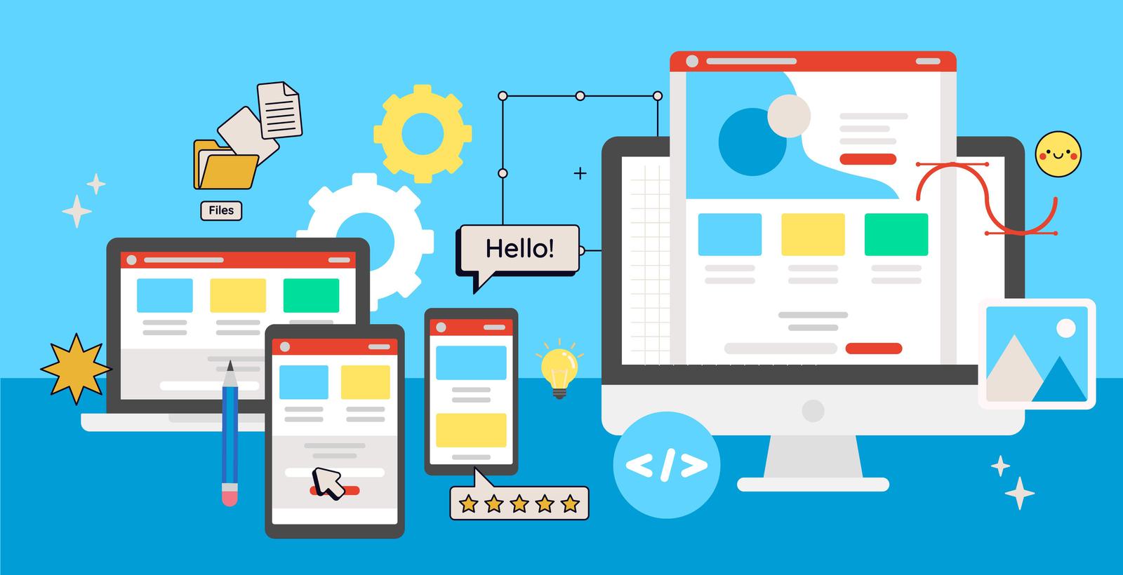
How do you make sure users find what they need on your website without getting lost, confused, or frustrated? It’s all about user interface (UI) design.
Last month, we talked about why it’s so important to nail UI design on your B2B website. Even the tiniest visual cues can have a monumental impact on how long a user stays on the site, what they think of your brand, and whether they decide to take action.
While UI and UX take a lot of thought and experience to design effectively, you don’t need to be a technological whiz to understand how UI affects your B2B brand’s website.
The function of UI in B2B
The user interface is everything a visitor sees and interacts with on your website, but what does it do? We highlighted five common goals of UI on the right.
Ideally, a B2B website should do all that while being easy on the eyes. A developer can achieve this by designing a branded and visually balanced set of UI elements to use throughout the site.
There are roughly four categories of UI elements:
- Input controls: Stuff that lets you submit information into a website, like a text field or checkbox.
- Navigational components: Stuff that helps you find your way around the site, like a menu or sidebar.
- Informational components: Stuff that shares information with you, like a modal (pop-up) or tooltip.
- Containers: Stuff that holds related content together in one space, like a carousel or card.
Common examples of UI elements
Buttons
What it is: You know what a button is! Click, and something should happen.
When it’s done wrong: The button is hidden or doesn’t look clickable, so users don’t know to click on it.
Though they’re some of the smallest UI elements out there, a lot of thought goes into making buttons look button-y (i.e., clickable). It’s important that users are able to quickly find the buttons they need. Developers consider factors like colour, contrast, size, text size, font, and placement to design buttons that entice people to click on them. Button copy should also clearly communicate, in just a few words, what action it’s inviting users to take (and what will happen after clicking).
Navigation
What it is: The system of menus, links, and design cues that help users find their way around your site.
When it’s done wrong: Users don’t know where they are on the website, and they don’t know how to reach their destination, so they leave without seeing your content.
To design your website’s navigation system, developers need to think about where the menu is displayed (and where it’s hidden), how it’s structured, what menu items to include, when to add sub-nav menus, the structure and hierarchy of content, breadcrumbs (a visual of where you are inside the website’s structure), and more. From there, they make a set of complex design decisions to provide an intuitive navigation experience, so the user never has to spend time pondering how to find what they need.
Forms
What it is: A fillable form that lets users request information, access a download, or get in touch with someone.
When it’s done wrong: Users don’t fill out the form or abandon it halfway through.
Forms are a crucial touchpoint for conversions in B2B websites. When a form has too many fields or requires lots of detailed information, that can be daunting, and many won’t bother. On the flipside, forms with fewer than three or four fields make it more difficult to accurately qualify leads. Too few fields can also make the form’s purpose unclear to users, who want a sense of assurance that their query will reach someone who understands their specific needs. Once the fields are nailed down, UI designers ensure the forms look fillable, are easy to use and understand, and invite the user to continue until they hit “submit.”
Cards
What it is: Rectangular or square modules that contain text, images, buttons, or other content.
When it’s done wrong: It gets visually distracting or overwhelming to the user.
Cards are a great way to highlight content you want users to see, helping to establish that visual hierarchy we discussed in Part 1. The trick to designing cards is to limit the amount of information they contain. An image, video, or animation should draw the user’s eye to the card, while a short burst of text should summarize a single idea, enticing them to click a button that will take them to a page with more information. As a small element meant to make content pop, cards should never be overstuffed.
CTA blocks
What it is: A call-to-action inside of a block or discreet container that is visually separate from other content.
When it’s done wrong: There’s too much text or it’s not eye catching enough to encourage CTA clicks.
Similar to cards, CTA blocks have their own container (square, rectangle, trapezoid, or whatever shape floats your boat) and are visually differentiated from other content on a page. There are a lot of ways you can style a CTA block, but the key is to keep it short and snappy. The exact design will depend on the action you want users to take, whether it’s downloading a datasheet, requesting a sample, or contacting a rep.
Accordions
What it is: Content the user can expand or collapse to save real estate on the page.
When it’s done wrong: It hides important content or forces users to guess where to find information.
When users only need one or two key pieces of information, accordions are an efficient way to organize a great deal of content. FAQ pages are a common example. A user can skim the headings on the accordion and expand what they need, while everything else remains hidden. An accordion saves space and helps the user easily find answers – just make sure you’re not burying any high-priority content inside an accordion tab.
Tooltips
What it is: A small pop-up that gives users advice on how to use a feature on the site.
When it’s done wrong: It’s annoying, distracting, or not helpful, and users don’t complete the action.
Remember Clippy from the old Microsoft Office suite? Famous for annoying the living daylights out of us, he serves as an important lesson in what not to do. Modern tooltips are not like Clippy – done right, they are helpful and unobtrusive. They come in handy when you have special buttons, interactives, tools, or other kinds of advanced functionality on your site, because they offer advice on how to use something that may not be self-evident for all users. It’s best if they’re designed to be small and easy to dismiss if the user doesn’t need help. Googly-eyed mascots are optional.
Carousels
What it is: A way to condense content into a set of horizontally scrolling boxes.
When it’s done wrong: It hides important content, so the user misses something you want them to see.
In the world of website UX/UI, carousels are a bit spicy. They come with the potential pitfall of burying important information, so developers usually recommend using them for less critical pieces of content. Content with a higher priority – something users want to see, or something you want them to do – should be in its own distinct place. When you have a lot of content that is similar or works as a series, carousels are an attractive way to display it without crowding the page. Instead of being forced to see it all, users can casually scroll through carousels if they choose. Image galleries are a natural choice.
What does my site actually need?
There are dozens more types of UI elements to know. Your B2B website could benefit from any of them, but it depends on a mix of factors including your product, brand guidelines, current design trends, and how you want your website to look and feel.
The best way to understand your website from a user’s point of view is to conduct a UX/UI audit. A successful audit will uncover the steps of your users’ journeys through the site, their goals and motivations, and any roadblocks or pain points they encounter.
It’s a lot of work, but a seasoned web developer can interpret all that information through their own knowledge, artistry, and technical prowess to create a stunning and user-friendly website.
Ready to unlock your site’s potential?
Ask our development team about a UX/UI audit for your B2B website.