What does an accessible website look like?
Accessible websites are easy to see, read, use, and navigate. Our web accessibility wiz explains how to do it right
This is the second in a two-part series on web accessibility. For a refresher on the legal side, how the guidelines work, and why it matters, check out Part 1.
There’s lots to love about web accessibility. Besides embracing an audience you may have overlooked, making your website accessible creates a better experience for all users.
We all know B2B has longer sales cycles, and recent studies shed light on what buyers do in that time: research, research, research. B2B buyers spend the bulk of their time online researching their purchase, looking for things like technical datasheets, videos, and blogs to teach them more about the product.
Why not make it easier for everyone to find what they need?
So, what DOES an accessible website look like?
The definitive list of accessibility upgrades is in those WCAG guidelines we covered previously.

“You want to aim for WCAG accessibility adherence,” says Ben Reimer, Web Developer at Motum B2B. “They have a comprehensive list, and everything relevant to your site should be considered.”
But let’s keep it simple. Here’s an overview of what you can expect from an accessible website.
It’s easy on the eyes
First off, your website should not be uncomfortable to look at. Colour choice is a critical part of that visual experience.
“A common example is colour contrast,” says Reimer. “When we build a new website, we take the brand colours, and as we’re designing it, we think about how we can use this palette in accessible ways.”
The WCAG specifies different colour contrast ratios depending on the text size, text placement, and compliance level you’re aiming for. You should also avoid distracting animations and content that flickers — in the best-case scenario, it’s jarring and annoying, and at worst, it could trigger a seizure in some people.
It’s readable
“An accessible site should be easy to scan, easy to read,” Reimer explains. “It’s not causing you a headache because the text is really cramped or has very short leading between lines.”
Though it’s not technically complicated, there’s a lot involved in making a website easy to read. You’ll want to look out for things like font (serifs are a common culprit), text size, and text spacing.
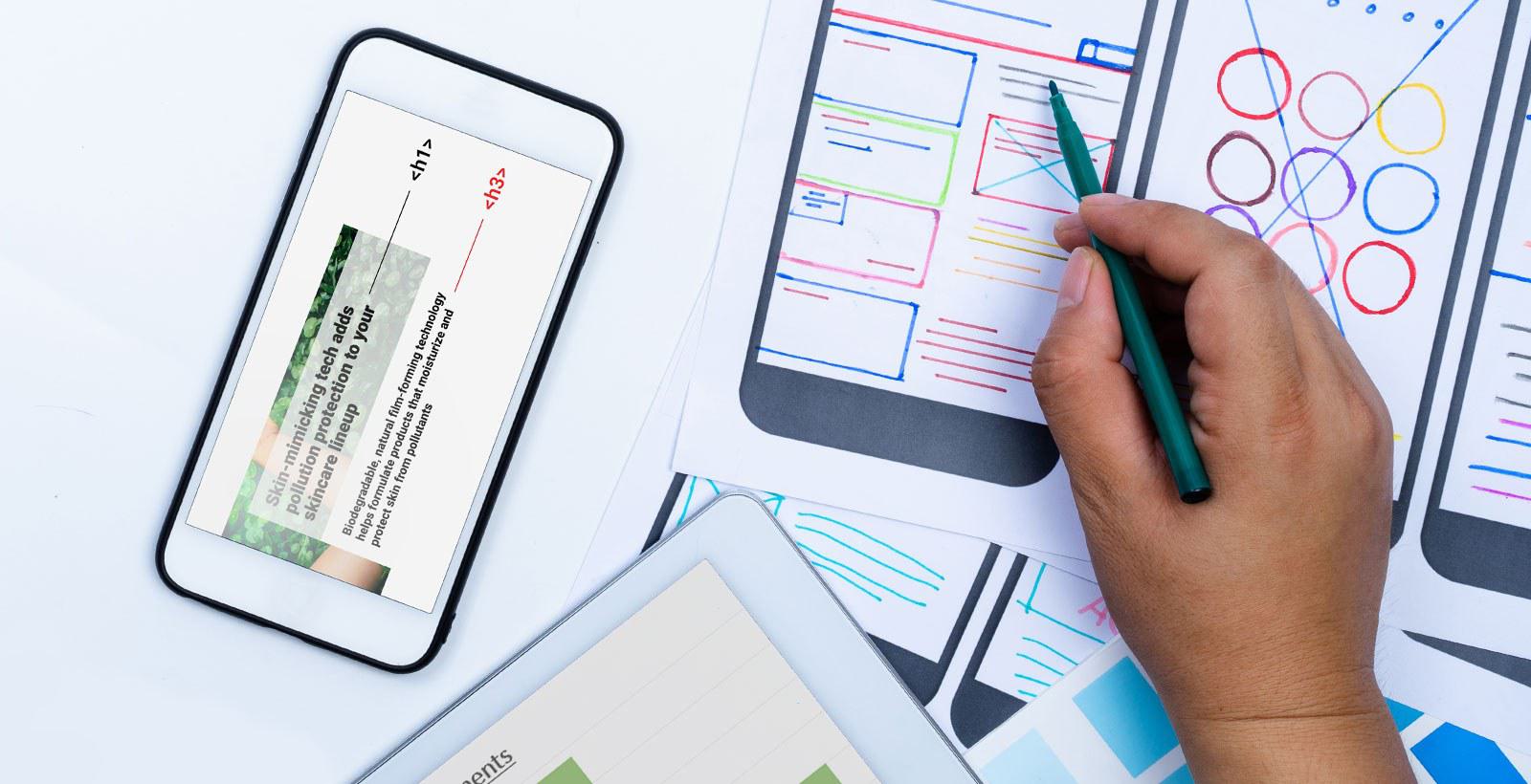
Accessible websites are written in clear, plain language, with shorter blocks of text organized under headings for easy scanning. They avoid flowery words, jargon, and rambling sentences. Links should be descriptive, so users always know what they’re clicking on.
It has descriptions on all visuals
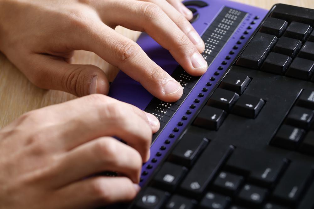
Not everyone can view videos and images the same way. For people with auditory impairments, it’s a good idea to add transcripts or captions to videos.
Images can be supplemented with alt text, which is essentially a short description of the image for anyone who may be using a screen reader or simply can’t load the images.
“Image alt text is great for accessibility, and it could be a quick win for most websites,” says Reimer, adding that alt text is relatively simple to implement. It’s all about describing the image accurately with brief, precise language.
For similar reasons, we like to add visually hidden text on buttons so that someone using a screen reader can see what the button is supposed to do.
It’s intuitive to navigate
We’re generally big advocates of clean, simple website design with enough whitespace for some visual breathing room.
It’s also important to make your website keyboard friendly, meaning it’s possible to navigate content using only simple keyboard commands.
“Not all users can use trackpads or mice. Keyboard navigation is helpful for people who may have a motor disability, but it’s also great for just navigating around quickly,” says Reimer.
Accessible websites often complement their keyboard navigation with skip links, which make it easier for users to jump to specific headings within a webpage.
It has straightforward forms
The design of your website’s forms can be a huge influence on how many completions you get. That’s why accessibility guidelines suggest paring down form fields, labelling fields clearly, and choosing better CAPTCHA options. The latter can be tricky — when asked to “choose each image with a motorcycle,” some users won’t have any way to proceed. As with most of these tips, simplicity is the best philosophy.
It uses dynamic content wisely
Dynamic content like overlays, lightboxes, carousels, and accordions are a bit more complex, so they need a deeper dive from web devs with accessibility experience.
We may recommend against features that feel invasive or distracting, like popups and autoplay videos.
Sometimes a tweak is all it takes. Any time we see components with more advanced functionality, we take a closer look to ensure they are accessible in terms of look, feel, and navigation.
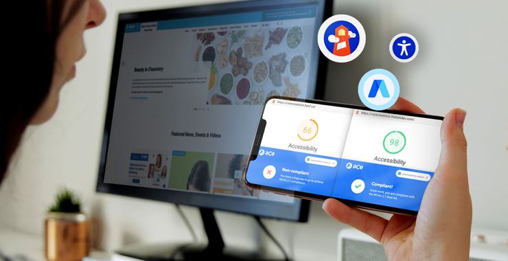
How do I check for accessibility?
At Motum B2B, we use a combination of tools including Google Lighthouse, accessiBe, Monsido, and Accessibility Insights for Web, which all scan for different accessibility checks at varying levels of depth. More advanced content needs to be assessed manually.
Making your website accessible doesn’t have to be a huge lift. Alt text and readable copy could be quick wins for any business, while the more complex things like navigation and advanced functionality require a developer to work within the code.
Sometimes an accessibility retrofit — basically an accessibility overhaul of an existing website — needs a bit more work to make the code match up.
“Retrofits sometimes need to change the markup of the HTML, so it’s more semantic. That means there’s code we can use in certain elements that provide more meaning to screen readers,” Reimer explains. “We do retrofits on older websites, but we build accessibility in from the ground up on our new sites.”
Besides the social and legal benefits, web accessibility is just plain good for business. An experienced developer with strong accessibility chops can help you determine the best way to make it happen.
Not sure where to start? Our web devs can help.
Get in touch with Motum B2B to build your new accessible website with all the bells and whistles.