What makes mobile web design so different?
Our ace developers explore what sets mobile web design apart from desktop and explain the logic behind making a B2B mobile experience fast, intuitive, and seamless.
We don’t have to tell you why mobile matters. The marketing community is well-versed in the benefits of mobile compatibility, and we see mobile traffic climbing steadily higher every year, especially as younger users join the virtual world.
In B2B, the virtues of mobile really shine outside of an office setting. Whether they’re travelling to meet customers, exploring tradeshows, working on the warehouse floor, or simply scrolling in the break room, potential buyers need convenient ways to access information about your products and connect with your brand.
On the user’s end, a mobile experience should be fast, intuitive, and pleasing to the eye. It’s much more than just a mini version of your desktop site, and there’s an art to making everything work seamlessly.
How do designers decide what to show, what to hide, and what to highlight as a critical piece of information or point of interaction? And why do these questions even matter? Let’s dive in.
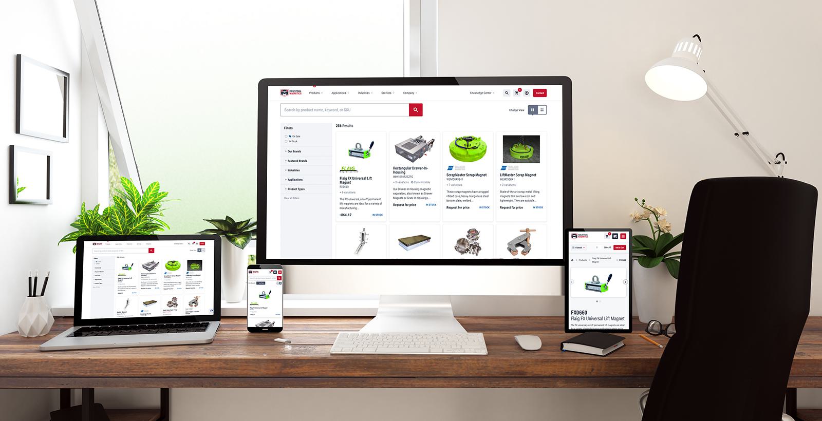
B2B mobile sites in action
What can a great mobile site do in B2B? Here’s some food for thought.
Imagine a potential buyer sees your booth at a tradeshow but doesn’t have time to stop by for a chat. As she passes by, she scans a QR code on your banner and gets a landing page featuring your most popular products, the highlights of working with your brand, and a contact form to get in touch. All the information she needs is at her fingertips — maybe it inspires her to stop by for a conversation later, or maybe she fills out the form and goes on with her day.
In another scenario, picture a worker on a manufacturing shop floor. Let’s say he’s doing maintenance on one of your products and runs into a hiccup. He does a quick search on his phone, finds one of your how-to guides, and proceeds with his work while following the instructions on his screen. Maybe that successful search prompts him to find more helpful content on your site, and maybe that leads to him discovering another product or accessory that would make his work even easier.
These are just examples, but the convenience of mobile allows for a vast and powerful range of possibilities. You just have to make sure it’s done right.
Making a mobile site
So, how are mobile sites actually made? Do you take the desktop site design and just kind of…make it smaller?
According to our panel of web designers, the answer is yes and no. The desktop site is the meat and potatoes of the design exercise, but the mobile version can’t be left for the end.
“We like to design up a few key pages on mobile devices while the desktop design is in play,” says Chris Fantauzzi, Front-End Lead at Motum B2B. “Our developers can make some assumptions about how things should look on mobile, but with more complex elements like a meganav, those require a separate, more guided approach.”
To simplify a technical process, designing a website starts with plotting elements out on a grid. That grid defines where site elements are placed, how they’re spaced out, and how they align with one another. It basically keeps all the design elements from becoming a chaotic jumble.
A desktop site with, say, six columns in the grid might go down to one or two in the mobile layout. This helps keep content from getting squashed as you scale down to the smaller format.
As the layout is condensed, you also need more spacing to give the content enough breathing room, which prevents the user from getting overwhelmed with visual stimuli. Clickable things like buttons and links need bigger “touch targets,” which are the zones you tap to interact with the element.
Then there’s text. You may have noticed that when you view the desktop version of a site on your phone, the text looks teeny-tiny and you need to zoom in. That’s a good example of why you can’t just scale everything down at a 1:1 ratio.
“With paragraph text, sometimes the difference between fonts in desktop and mobile are only a few pixels different, while it's much more pronounced with headings,” says Ben Reimer, Senior Front-End Developer at Motum B2B. “Legibility is really critical, so we have tools that let us scale it down an appropriate amount. Then we’re styling these paragraphs to make them easy to read, because readability comes first.”
That’s just a small glimpse at all the things designers need to keep in mind during this process. All those changes have a big impact on the way content is displayed, and certain things will take priority over others.
A hierarchy of content
When it comes to ensuring everything is displayed logically on a mobile site, Nicole Wu, Front-End Developer at Motum B2B, says it’s all about establishing a hierarchy of content.
“You have to prioritize the content, because you don’t have much space, and you can’t show everything at once. We need to ask ourselves, what can I hide, and what is most important to show up front?”
Reprioritizing content is the first step in mobile site design. Developers need to think about how to guide the user’s eye on a smaller screen.
“You have so much less horizontal space. Primary navigation needs to get shrunk down into a hamburger menu,” says Reimer, referring to the nav menu icon with a stack of three lines (like the layers of a hamburger). “We have different break points as the screen gets smaller, and bit by bit, we remove things to be hidden.”
So, what’s most important to display? Key points of interaction are high on the priority list, such as the shopping cart icon on an e-commerce site — those need to be visible at all times. Other things are determined by working closely with the client to understand their priorities. They may have certain elements they want to feature more prominently, whether it’s specific messaging, product links, or calls-to-action.
“It’s an exercise of criticality,” says Reimer. “If it’s not critical, we can hide it.”
Hiding elements
In less important mobile interactions, text-based content is nested in elements like accordions and drawers, which essentially hide the content in a container that can be expanded and collapsed with the tap of a finger.
“We’re not necessarily cutting out content entirely, but we might be hiding it,” Wu explains. “For instance, on desktop, you might have content fully laid out in paragraphs, but on mobile, you might have it hidden in accordions instead.”
For images, we often use carousels. This element only takes up one row on the site, but it allows users to scroll through a set of multiple images as they like. Carousels also work well for content relationships, such as a blog that features a handful of related blogs further down the page.
“You can generally expect more interactivity on mobile sites,” says Fantauzzi. “You have more choices to show the user, or maybe more complex choices, on a B2B site. Interactivity helps to make those choices as easy as possible.”
Are there exceptions to the rules?
Of course, there’s a caveat to all these design philosophies: the mobile and desktop versions still need to be similar enough to feel like the same site.
“We try to design certain components that work for both desktop and mobile, so the experience can be as similar as possible,” Wu explains. “You don’t want the user to have to relearn something when switching between devices. You don’t want to increase the cognitive load, so we make it simple for them to switch.”
In general, it’s important to stay on top of the latest in web design tech. The Motum B2B web team is always looking out for new tools and code frameworks that make mobile experiences better, smoother, and more consistent across devices.
Need help crafting memorable online experiences?
Ask our web team how we can take your B2B sites to the next level.