How meganavs power up B2B website engagement
Meganavs are a smart, visual way to boost navigation, interaction rates, and content discoverability on your B2B website.

Meganavs: they sound like a vehicle the Power Rangers would drive, but they bring serious benefits to a website’s user experience (UX).
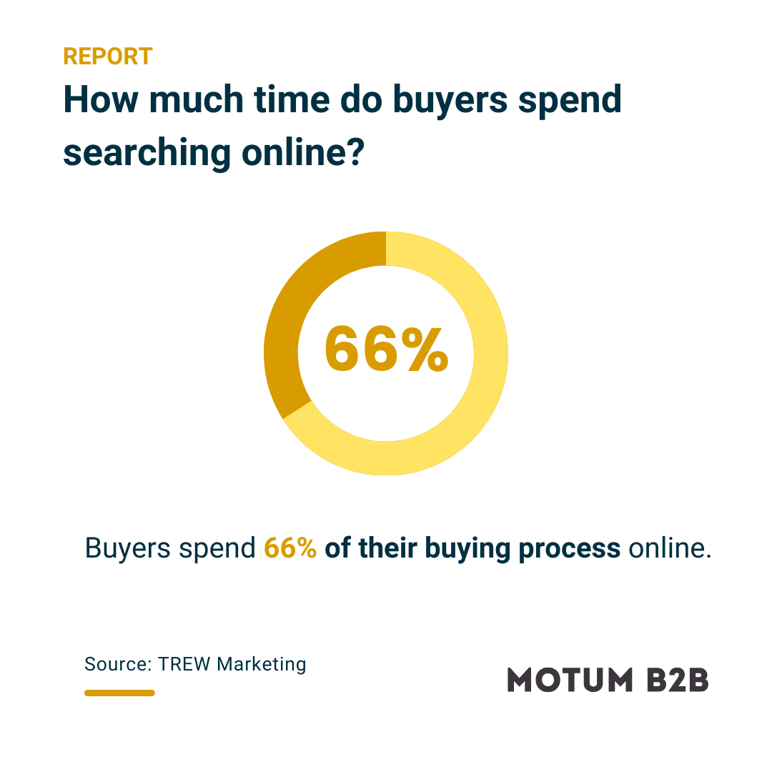
Navigation is a known source of friction for users on a B2B website. If a site’s design makes it too slow or frustrating to find what they want, visitors (including B2B buyers) will simply leave.
Studies show that meganavs (also called mega menus) can greatly reduce this friction. They’re as powerful as the name makes them sound. When done right, meganavs have the potential to turbocharge your users’ ability to navigate your website, find the content they need, and ultimately grow their trust in you.
Meganavs are like mini sitemaps with visuals.
To understand what a meganav is, first picture your standard website navigation menu. Now picture it a little bigger with additional links, icons, images, and maybe even a video or two.
Ben Reimer, Web Developer at Motum B2B, puts it this way: “Unlike a regular navigation, the top-level items of a meganav expand a container, and that container can be filled with more links organized in a hierarchy.”
That bit about hierarchy is important. If you have a more robust B2B website with lots of products and services, you might have multiple levels of navigation within your site. The meganav would make the subsections visible in one container, meaning a user wouldn’t have to hover or click through several menu sections to find the subpage they need.
When and why would you choose a meganav?
It’s easier to start with the reasons why you wouldn’t want a meganav. If your website is small — i.e., it’s a microsite, a landing page, or a site with relatively few sections to navigate through — then you’re probably fine with some version of a standard navigation menu.
As we’ve seen with many of our own clients, that often isn’t the case in B2B. Companies tend to have multiple sections for things like products, services, applications or industries served, and resources such as blogs, videos, technical downloads, and press releases — not to mention dozens of additional subsections or “child” pages within each category.
Those added layers of complexity make a strong case for a meganav.
“Being able to traverse all that content quickly is really helpful to the user,” Reimer says. “The navigation is the user’s primary way of getting around, so the meganav offers them much more options and a better sense of what this website looks like and what it contains. Meganavs have been critical in making B2B websites easy to navigate.”
The meganav’s design is much more visual than a traditional navigation menu, which makes it excel at showing the breadth of what a B2B website has to offer.
“The meganav gives the user more granularity at a glance,” Reimer explains. “It shows all the related pages to that top level of navigation, so instead of needing three or more clicks to access a deep internal page, it’s accessible in one click.”
With more room for creativity and innovation, meganavs can be a lot more interesting to look at. For example, you might design a product-related section with links to one side, leaving the other side open to things like images of featured products, icons of product categories, a video of a product in action, or a combination of those elements.
“It’s an opportunity to create more interest with related media,” says Reimer.
Just as meganavs help users find what they’re looking for, their visual capabilities can put the spotlight on content you want them to see, whether it’s a newly launched product, an important announcement, or any higher-priority content that lives within a deeper level of the site’s hierarchy.
Meganavs succeed with thoughtful organization and design.
Most meganavs are designed horizontally, but they can also be vertical or organized into tabs. Horizontal and tabbed designs work best for websites with many categories and subcategories of content, while vertical designs can add visual spice to sites with simpler structures.
With all the creative potential meganavs bring, there is the potential for visual clutter, so a strong design should emphasize simplicity and structure.
“It’s important not to make the meganav too large,” Reimer says. “We don’t want to overwhelm the user. It should still feel like a navigation and not like they just opened up a subpage full of content.”
Because they’re meant to streamline a complex website hierarchy, he adds that meganavs must be organized in a logical way to perform as intended.
“A clear information architecture is key. It’s important that the content is organized in a way that makes sense to the user with proper nesting, so the context is critical.”
A more specific best practice addresses a common user annoyance: accidentally hovering over an area with your mouse while trying to reach a different part of the meganav. The devs at Motum B2B use special code to create a buffer between hover-able items, adding a bit of forgiveness as the user hovers past different items.
Meganavs are best approached with thoughtful planning around its structure and organization, which starts by understanding the sitemap.
“We start with the most critical information first,” Reimer explains. “We look at what the pages are, which ones would benefit most from a meganav treatment, how page links are related to each other, and how we can utilize all that in a relevant way.”