How advertising shapes our society and culture
These ad campaigns aren’t just iconic — they’ve had a lasting impact on the way we live. Check out 5 concepts that wouldn’t exist without advertising and marketing.
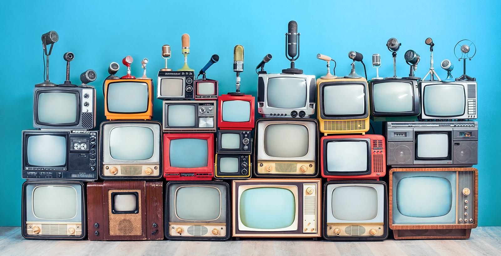
Some advertisements make you laugh, others make you think, and others pull at your heartstrings, but only a select few make a lasting impact. We’re talking concepts so normalized that we barely give them a second thought.
It sounds like a tall order, but ads have the power to change societal customs, shape our perception of cultural icons, and bring awareness to knowledge that was previously hidden away. These five exemplary ad campaigns prove it.
How Santa got so red and jolly
Coca-Cola, 1931
Coca-Cola didn’t invent Santa Claus, but they did popularize a specific portrayal of the cheery gift-giver we all know. Santa’s origin can be traced back to 4th century Greece, where he was known as Saint Nicholas, a bearded bishop who gave generous gifts to the poor.
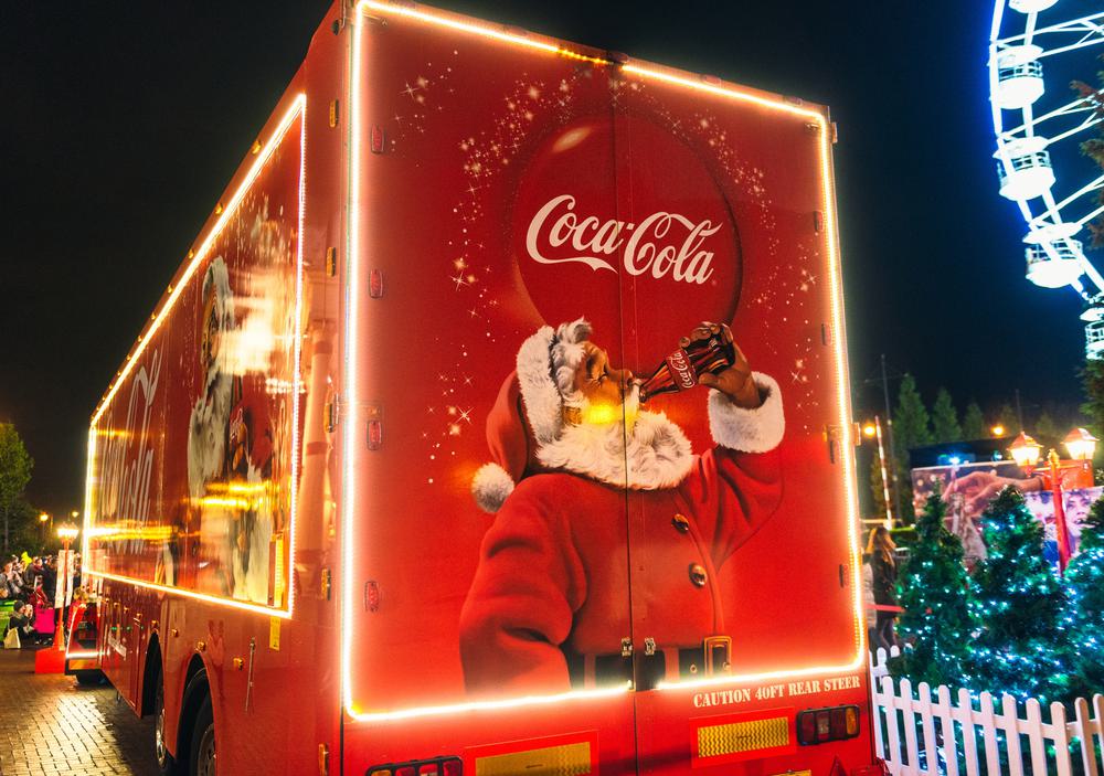
Spanning all different eras, religions, and countries, Saint Nick’s image has changed a lot since then. Sometimes he wore a green fur-lined coat, sometimes red; sometimes he was chubby, sometimes thin; sometimes he sported a pointed cap, sometimes one with ear flaps; and he was usually bearded, but not always.
Today, the image we share of Santa is of a rosy-cheeked, white-bearded man wearing a red suit and pointy hat trimmed with white fur. (The Coca-Cola corporate colours, you’ll notice.) In most portrayals, you see him with a jolly smile and rounded belly. This version sprang from a series of ads that began in the 1920s and 30s.
According to Coca-Cola’s recounting, this popular version meshed ideas of the eternal, symbolic Santa with a more humanized depiction. A retired salesman posed for the first set of illustrations, and the resulting Santa was shown in relatable situations (like raiding the fridge and drinking a Coke).
How diamonds made for the perfect proposal
N.W. Ayer, 1900s
Diamonds are the most romantic of all the clear rocks. For many marriage-seekers in our society, giving or receiving a diamond engagement ring is the epitome of romance, but it wasn’t always.
Before World War II, only 10% of engagement rings had diamonds in them. Most were made with coloured gemstones like sapphires, rubies, and emeralds, while diamonds were seen as a luxury reserved for the ultra-rich. The economic conditions of the times had people more interested in spending their money on practical purchases like appliances and cars.
With the noble goal of making people feel compelled to spend money they don’t have, DeBeers turned diamond engagement rings into a symbol of everlasting love and commitment.
To market to consumers at different income levels, they tapped into the emotional resonance of love and marriage, concepts that were socially valuable enough to transcend economic hard times. They created a slew of ads and educational content that supported their brand and the new values they were trying to create.
The multi-pronged campaign ran for decades, but the highlight was its iconic “A Diamond Is Forever” slogan, which has appeared in every DeBeers ad since 1948. Consistent branding, persistence, and a ton of supporting content made the diamond ring what it is today: a ubiquitous symbol of love.
How we know media images are heavily altered
Unilever, 2006
When it comes to influential marketing campaigns, Dove is one of the greats, but Evolution stands out among all of them. As part of a larger campaign focused on raising awareness around beauty standards and self-esteem (Dove Campaign for Real Beauty), Evolution identified all the ways fashion models are lit, posed, made-up, styled, and Photoshopped to create the perfectly airbrushed alien lifeforms we see in billboards and magazines (and now online).
Besides scoring 12 million views in its first year and winning numerous awards, the campaign sparked a slew of conversations on mainstream TV and news networks. The larger campaign popularized the idea of diversifying portrayals of women in all types of media. Today, consumers are a lot more literate about the artifice behind these types of images, and they continue to call for more diversity and representation.
As a side note, many (if not most) beauty standards are shaped by cultural and societal trends. At different points in time, people were really into things like bold veins, plucking out eyelashes, or emulating the look of a Tuberculosis patient. The role of advertising (whether it’s old-timey magazines or influencer channels) is usually to reinforce and perpetuate these standards, so it was a revolutionary moment for consumers to see Dove dispelling the illusion.
How coffee breaks are a regular thing
Pan American Coffee Bureau, 1952

Anyone thirsty? Coffee skyrocketed in popularity after World War I, when American soldiers got the newly invented instant coffee as part of their field rations (the phrase “cup of joe” comes from those good ol’ GI Joes). In the years that followed, coffee vending machines started to crop up around office buildings, and employers noticed a resulting jolt in productivity.
It wasn’t until 1952 that the term “coffee break” was coined and cemented as a part of everyday work culture. The Pan American Coffee Bureau’s campaign aimed to encourage 15-minute midday breaks with this short message: “Give yourself a ‘coffee-break’ — and get what coffee gives to you.”
An estimated 70% of businesses started to provide coffee breaks thereafter. The tagline may sound awkward today, but we’re grateful for our delicious hot bean water.
How we think blue is for boys, pink is for girls
You know how assigning colours to sexes feels a bit…made up? Well, like most other things on today’s list, it is — though this one is not so much a single campaign as a collective effort by several players in the American fashion industry.
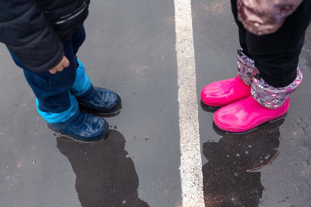
Around the turn of the 20th century, the norm was to dress children of both sexes in bleached white dresses up to the age of six. When pink and blue pastels started to emerge in children’s clothing trends, they weren’t pitched as gender specific. Articles from the 1910s and 20s argued that pink, a bold warm colour, best suited the boys, while dreamy and delicate blue was more appropriate for girls.
In the 1940s, for mysterious reasons, retailers and manufacturers switched it up to make pink a girls’ colour and blue a boys’ colour. There was a brief effort to make kids’ clothing gender neutral again, but as you know, this is the designation we eventually stuck with.
How tiny hippos invaded our homes
Concerned Children’s Advertisers, 1999
This is more of an honourable mention for our Canadian readers, but one of our country’s most iconic ads was a public service announcement. It introduces the delightful house hippo, a fictional hippopotamus shrunk down to the size of a common rat. The nature-documentary-style narration describes it sneaking around your house at night to steal bits of lint and crumbs from your leftover peanut butter toast.
Despite the ad’s adorable premise, it ends with a stern warning not to believe everything you see on TV. While not as far-reaching as the other ads we’ve covered, it served as a memorable lesson to Canadian kids and adults alike. Honestly, it’s so cute that we just wanted you to remind you it exists.
Can your next B2B ad make an impact?
We’ll bet you a cup of joe that it can. Talk to our creative team to start brainstorming.