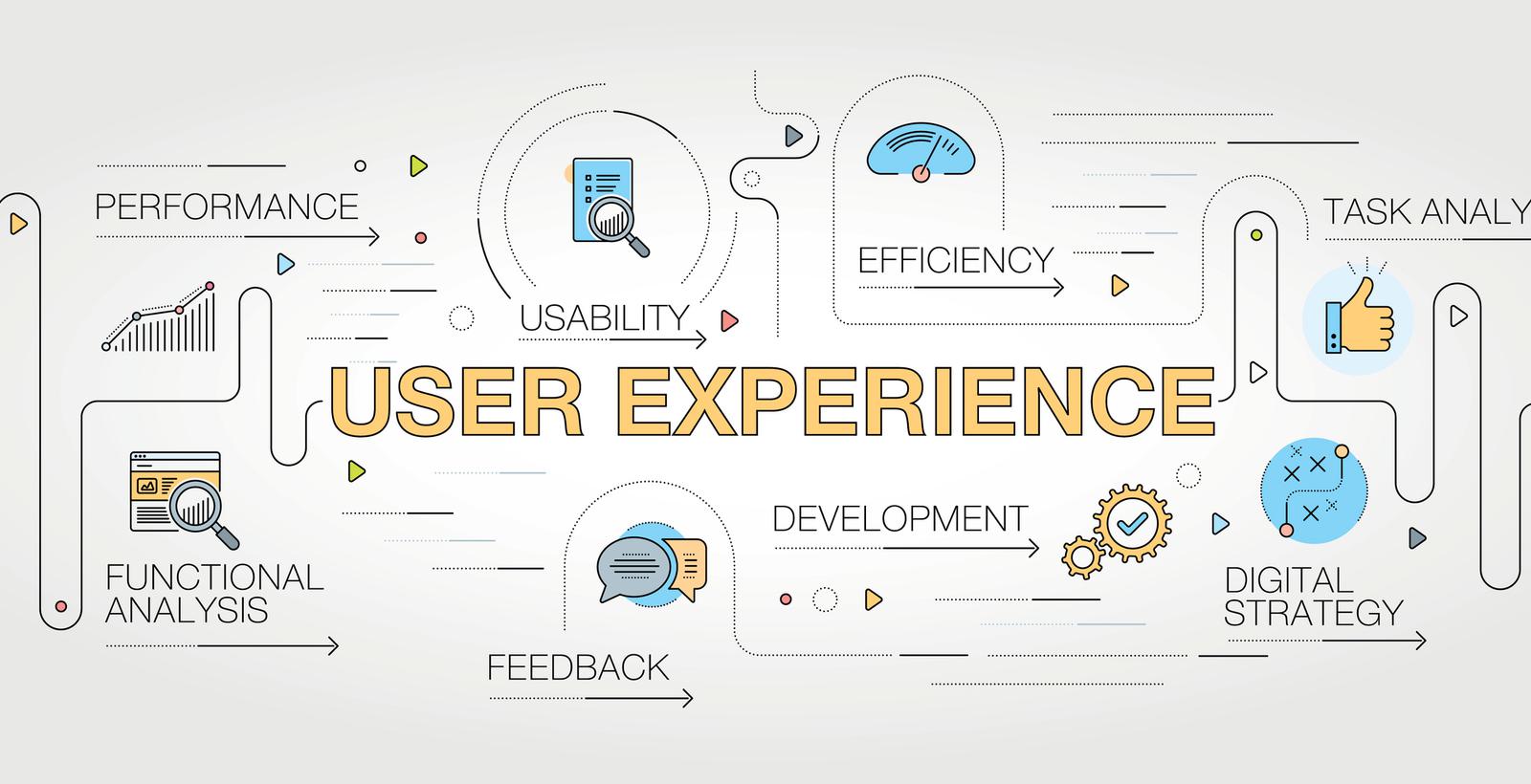
Great UX and UI makes a difference in B2B
Having a well-designed UX and UI is increasingly important as competition grows and B2B buyers become more tech-savvy

A page that takes too long to load. Overlapping text. Crowded menus. Hard-to-find buttons and unclickable elements. These are all common examples of a poor user experience design (UX) or user interface design (UI).
In today’s digital environment, a user’s website experience can make the difference between a conversion and a closed window. In the B2B world the stakes are even higher, as the buyer’s journey is typically longer and involves many more steps than a standard B2C purchase, and every online action is a chance to skip or shorten a step.
Two Motum B2B web developers discuss the ins and outs of effective B2B UX and UI, as well as some best practices to follow to help create a smooth and seamless user experience along the buyer’s journey.
Aren’t UX and UI the same?
While user experience design and user interface design share some common goals and attributes, they’re technically different disciplines.
“UI is the visual layout of components that you see and interact with, while UX represents the experience that the user has interacting with that layout,” explains Ben Reimer, Web Developer at Motum. “They're similar in that you need both to have a happy customer, but different in that UI is visual, while UX is almost psychological.”
Striking the right balance is important here. A website that’s beautiful but difficult to navigate can frustrate users and cause them to leave, while a website that’s functional but tough to look at could convey unprofessionalism and diminish buyer trust.
“UI and UX is somewhat invisible,” adds Reimer. “You only notice it when it's done poorly.”
The simplest way to look at user interface design is as a key ingredient in the mix that makes up the overall user experience.
Why does it matter?
User experience and interface design are imperative to any businesses’ online presence — and potentially their survival.
Studies show that 88 percent of online shoppers say they won’t return to a website after a bad user experience, and poor usability is at fault for 70 percent of online businesses that fail.
On the user interface side, people form 75 percent of their judgment on a website’s credibility purely on its aesthetics, and poor mobile optimization “annoys” 48 percent of users.
“I like to think of a website as an interactive business card,” says Chris Fantauzzi, Lead Front-End Developer at Motum. “If your business card is a blurry piece of scrap paper, it’s likely a pretty bad impression. It makes a huge impact when somebody is greeted with a site that they find appealing and engaging.”
Fostering a positive user experience is especially important in the B2B world where buyers can spend days or even months researching products and services, compared to minutes or seconds in the B2C realm.
Good UX and UI can also help B2B buyers find tools that deliver added value and supplementary information, including data sheets, demos, how-to videos and other visual and interactive elements.
“We have a lot more information to convey to the user in the B2B space,” says Fantauzzi. “B2C spaces that I've worked are always more focused on UI and less focused on UX. There’s no ’Buy now’ button for B2B products — it's ‘Request a quote’ because typically they’re very expensive and there's a lot of research involved, so usually they require more information to make a confident buying decision.”

Loading….
From crafting a homepage to creating a product page and designing a form, every element on a website can make use of user-first best practices.
An increasingly important facet of user experience design is accessibility. A number of laws have been introduced to ensure that websites are accessible to persons with disabilities that make it difficult to read or use certain elements on a page, and more are on the way.
“Accessibility is interesting because it can occasionally pull us away from implementing common UI designs,” says Fantauzzi. “Sometimes we're locked to certain colour contrast ratios that are more accessible, for example, because we want to consider our users holistically and not just some of our users.”
The World Wide Web Consortium’s (W3C) Web Content Accessibility Guidelines 2.0 outlines four key areas of focus for website accessibility. In Ontario, Canada, private and non-private organizations with more than 50 employees and all public sector organizations must comply with these guidelines or face fines of up to $100,000 for each day of violation.
Another important yet invisible area of strong UX is fast loading times. Most sites have a load time of 8–11 seconds, and it’s important to remember that users are impatient. The longer a site takes to load, the higher the percentage of users who will back away. Three seconds can be all it takes to lose a visitor.
“Making sure that our pages are loading fast is something we've been focusing on a lot more at Motum. This is a huge part of user experience,” says Fantauzzi. “Depending on the product, some users were willing to wait and some users were not.”
How Motum makes UX/UI
UX and UI aren’t just lofty conceptual goals or ideas. Through the right strategy they can be discussed, designed, altered and measured. Now more than ever, customers are aware of the importance and the difference strong user experience and interface design can make.
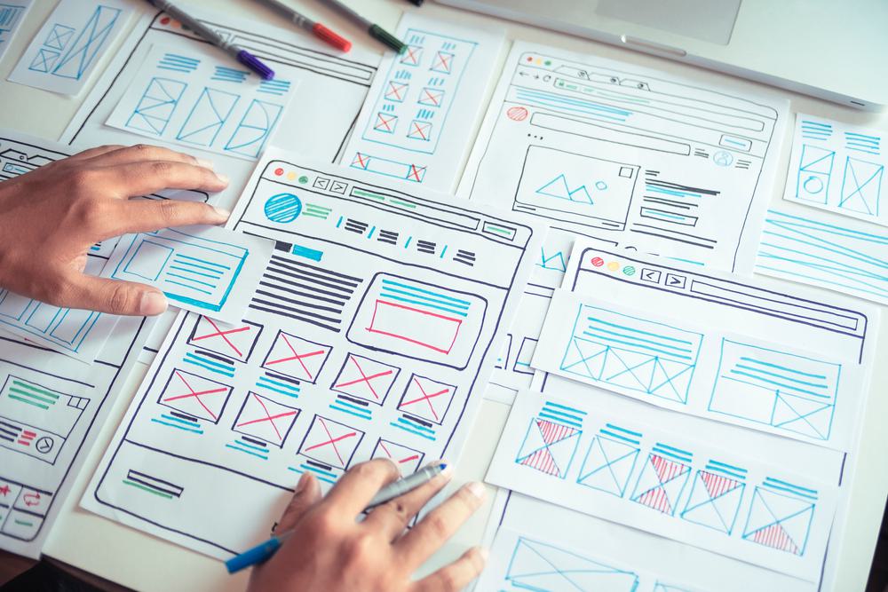
“We've refined our processes to put UX at the forefront, right from the beginning of the project,” says Fantauzzi. “We focus on UX first, deciding where the elements should roughly go and what they should be, and then we make it look nice, so in our wireframes we always go from UX to UI.”
Afterwards, there are tools such as analytics software programs, user testing and eye trackers that help to gauge the effectiveness of a site’s UX and UI. In the future, expect to see new trends like Google’s Core Vitals and neomorphism to emerge and change the way UX and UI are implemented.
“Our clients and the industry itself are understanding the importance of UX and UI, so we're really focusing on it a lot more nowadays,” says Fantauzzi. “Everything from start to finish needs to leave the user feeling confident with their decision to buy from your company.”
Want more information on user experience design? Does your site need a UX/UI overhaul? Contact Us, we can help.