How to use your B2B website as a sales tool, Part 3: Forms
What goes into a web form that converts? Two Motum B2B developers discuss the dos and don’ts

Web forms seem like a straightforward webpage element, but there’s more to them than meets the eye. For one, they help you weed out robots in disguise — see what we did there? — to separate real users from bots who fill out the form automatically. You also need to be strategic about the information you request (do you really need the user’s phone number?) and where the form is situated on the page.
Effective forms take all these things into consideration, and if you want your form’s completion rates to be higher than the competition’s, you should too.
Less is more (effective)
“The primary goal of web forms is to convert users into leads,” says Ryan Iusi, Managing Developer at Motum B2B.
A conversion could mean showing the user a particular piece of website content or turning them into a full-fledged customer. Either way, the form’s design plays a big role in getting them that far.
“The form needs to be designed with the user in mind,” adds Chris Fantauzzi, Lead Front-End Developer at Motum B2B.
Form fields are a big part of usability. As consumers become more aware of online security risks, they become more reluctant to share their personal information. When designing web forms, it’s important to consider which fields are strictly necessary.
Essentially, the fewer the number of fields, the higher the completion rate will be.

“You don't want to ask for too much information,” says Iusi. “You only want the relevant information you need to convert that person. Keeping the form as small as is possible is usually a primary goal.”
An address field, for example, is usually not necessary unless the user will need something shipped to them.
Learn about layout
Contrary to popular belief, people aren’t too lazy to scroll down the page, and the strategy of cramming more elements above the fold has been dismissed by research and eye-tracking studies. Instead, make sure the form can be found easily by users.
“We shouldn't think of the internet like a scrollable newspaper. Forms can be placed pretty much anywhere now,” says Iusi. “Ideally you want your form to be positioned on the page instead of popping up as a modal — it's probably best to have the form as a hard-coded or inline element.”
Embedding a form as an inline element keeps the user on your landing page, minimizing the clicks and load time it takes to reach the form.
It’s also crucial to ensure your form is mobile-accessible, and in some cases it’s useful to have a chatbot on your site to guide users. Chatbots can recreate the flow of a text conversation to make forms easier for mobile users to fill out.
“Chatbots are a newer way to capture leads, and it's more of a conversational marketing tool,” says Iusi. “Instead of having an explicit form field that asks you to fill in the form fields without prompts, bots create a conversational flow.”
Security!
If you’ve ever filled out a web form, you’ve almost certainly done a security test asking you to identify which images contain a school bus or decipher a series letters to prove you’re not a robot. Beyond those, there are more security practices going on that most end-users won’t ever see.
“Honeypot fields are invisible form fields that a human won't be able to see, but a robot would likely see and fill out,” says Iusi. “When that form field is actually populated, we can tell that a robot must have submitted this form because it’s invisible to humans.”
Some security tests are more straight-forward, instead simply asking you to check a box.
“The checkbox is based on timing,” says Iusi. “If you hit the page and that checkbox is immediately checked, usually that's a bot because no human can click that fast.”
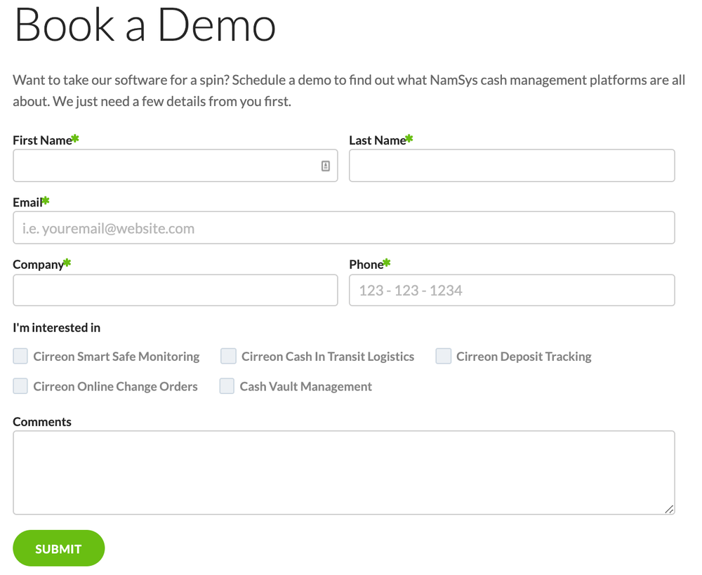
 Placeholder text makes it easier for inexperienced web users to fill forms
The little things
Now that you’ve figured out the best possible layout for your form, implemented some security features and nailed down the right questions to ask, what comes next? The most effective forms use accessibility and validation elements to boost completion rates.
Accessibility elements include things like drop-down menus and placeholder text. These elements make it easier for inexperienced web users or people with disabilities to fill out the form.
“Making forms accessible is pretty important,” says Fantauzzi. “It ensures forms can be read by people with assistive technologies. It's just a matter of taking that extra step when you're developing the form.”
Validation elements provide feedback when a field is filled out and play a similar role to accessibility elements.
“If a form is being validated and the user won't be able to submit it, a good practice is to leave the submit button grayed out and unclickable until validation is done,” says Iusi. “Having a feedback message about that is also really useful.”
Finally, there are SEO considerations. Using clear action words and descriptions can help customers find your form and lead to more conversions.
“Instead of saying ‘submit,’ it might say something like ‘get my quote today,’ or ‘let's get started now.’ That's beneficial for accessibility as well as SEO, because someone who just sees ‘submit’ may not know what the CTA is prompting them to do,” says Iusi.
Forms are an important tool and first point of contact for customers, and they can be an engaging and stand-out component on your site with a little bit of love and attention.
If you’re looking for an effective form for your businesses, you’ve come to the right place. Get in touch, and we’ll design a form that checks all the boxes.