Make your data stand out with data visualization
Google Data Studio is a helpful tool for making your data more presentable and accessible

When you hear the word “data,” you might picture a chart or spreadsheet of uninspiring static numbers. B2B marketers have long struggled to find a way to make data accessible and engaging — or use it in a presentation without putting the viewer to sleep.
Enter Google Data Studio.
Google Data Studio is a data visualization tool that allows marketers to easily compile, analyze and share marketing data. It also features tools for creating interactive dashboards and visually appealing reports.
Let’s say you’re putting together a presentation for your team. You want to illustrate the full scope of last quarter’s marketing efforts and how they have helped the company, which means drawing data from, let’s say, Google Analytics, LinkedIn Ads, Shopify, YouTube Analytics, QuickBooks and Google Sheets – and present it all in a way that’s nice to look at. Sound like a gigantic hassle?
Google Data Studio makes it way simpler than you’d think. Here’s why Motum B2B’s own analytics team thinks it’s an effective tool for making data more accessible and attractive.
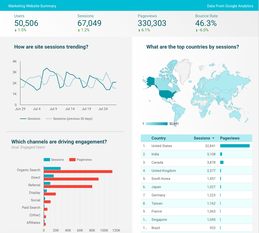
Google Analytics and Google Data Studio: What’s the difference?
While Google Data Studio shares some features with Google Analytics, they’re two separate programs with their own unique applications.
Google Analytics is website-focused and collects two types of data from a site: user acquisition data and user behaviour data. It specifically helps paint a picture of the website’s effectiveness, but it can’t be applied to other platforms.
Google Data Studio, on the other hand, can pull data from up to 12 sources, including Google Analytics and Ads, social media platforms, databases and other marketing programs. The main goal of Google Data Studio is to create an easy-to-understand representation of relevant data to the necessary audience.
“Google Analytics collects and reports on website behaviour, while Google Data Studio draws and displays information from data sources,” explains Steve Lendt, Director of Engagement and Analytics at Motum B2B. “On the display side, we have controls over how the data looks and its colour and style.”
If you think of Google Analytics as a specialty store where you can access a deep database of data from one source, Google Data Studio is more like a department store that displays data from a variety of sources in visually appealing ways.
“With Google Analytics, you can really drill into the information and segment the data,” says Lendt. “However, if you don't want to dig around Google too much and just want to see all your data in one spot, Data Studio is great for that.”
What can you do with Data Studio?
Google Data Studio uses data from the selected sources to create customized dashboards that are easy to read, share and present. The data is also live, so the reports will dynamically change along with the corresponding data.
Data visualization allows our brains to comprehend and understand sets of data more effectively, and also helps us see patterns, trends and outliers in a data set. It’s also a useful way to collect and manage a vast array of available data without it becoming overwhelming.
“Data visualization gives people quick access to know what's going on in a single cross-platform source, which then enables them to make better decisions because they can access the data faster and understand it better,” says Lendt.
High-level metrics are important to more than just the marketing team: stakeholders and decision-making units greatly value this information and use it to strategize and make business decisions.
“The people who make marketing decisions like to have the data clearly displayed for them,” says Camilo Parra, Marketing Engagement Analyst at Motum B2B. “Google Data Studio saves time for them because they have access to a dashboard with their data all in one place, rather than having to go to all the different data sources.”
Data Studio uses the data to create dashboards with customizable graphs, charts and maps, turning what would otherwise be static and uninspiring spreadsheets into beautiful representations of data and trends.
“I've put out a lot of reports, PDFs and PowerPoints, but nothing gets looked at more than the dashboards,” says Lendt. “The dashboards are really ruling that in that way.”

Your data is beautiful
The greatest feature of Google Data Studio may be its ability to present relevant data in a way that’s both aesthetically pleasing and easy to access and understand, as well as its flexibility. Different metrics are important to different people, so it’s important to consider what data to display and what to leave out.
“Every client is different, so we use Data Studio because of the in-depth customization of the content we're showing,” says Parra. “Some people only want to see the high-level ‘overall’ metrics like users, sessions and page views, but most dashboards are very customized depending on the companies’ needs.”
Data visualization is one of the most effective methods for conveying information in an appealing way that resonates with viewers, and Data Studio lets you do that easily with multiple data sources. For many marketers, it’s a no-brainer.
“Your data is beautiful,” says Lendt. “Use it to unlock the power of your data to create interactive dashboards and beautiful reports that inspire.”
Looking for an analytics and engagement expert to help your business? Get in touch, we can help.