A shiny new website for Pearl
A provider of high-performance home certifications expands its reach with a modern, user-focused website refresh
A shiny new website for Pearl
A provider of high-performance home certifications expands its reach with a modern, user-focused website refresh
Challenge
A startup looking to establish themselves as the go-to assessment and valuation authority for U.S. homeowners, contractors and realtors, Pearl Certification needed a total website revamp. They aimed to evolve their basic WordPress site into a dynamic, modern online presence with a fresh look and feel.
Solution
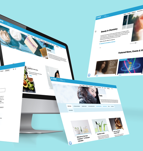
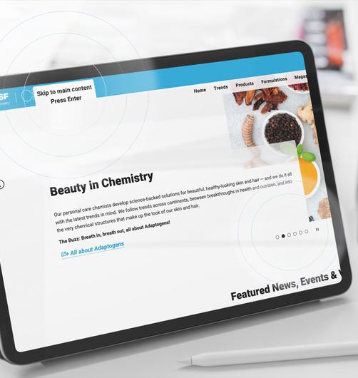
We transformed the website into a tailored experience – one that addresses Pearl’s primary audiences with customized user journeys and content for each customer segment. Accompanied by a larger visual branding and identity effort, the new site features a refreshed look and feel, as well as an intuitive interface designed with users in mind.
Built to stringent accessibility standards, the website pulls in data through direct API connections to Pearl’s larger ecosystem of parallel apps and customer tools. React-based customized web tools allow for fast API-driven functionality across the site.
It’s also fully integrated with Salesforce Pardot for targeted lead capture, profiling and nurturing. A custom analytics board integrates multiple data sources into one comprehensive reporting centre.
Want to explore user journeys, fresh visuals and in-depth analytics? Call us.


