Showcasing a bold, beautiful rebrand
A maker of industrial magnets launches a rebrand that unifies its many logos under one powerful umbrella
Showcasing a bold, beautiful rebrand
A maker of industrial magnets launches a rebrand that unifies its many logos under one powerful umbrella
Challenge
To solidify their place as leaders in the magnetics industry, Industrial Magnetics, Inc. (IMI) needed a full rebrand. They wanted the new logo and design elements to unify the different aspects of their brand, and when it was done, they needed help showing off their new assets.
Solution
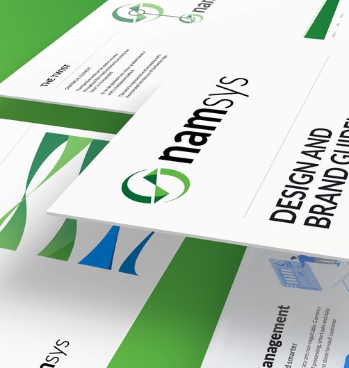
After a series of exercises to understand their values and objectives as a brand, Motum B2B designed a set of brand guidelines to bring their core logo, sub-logos, and their favourite aspects of the original IMI logo under one visually unified umbrella.
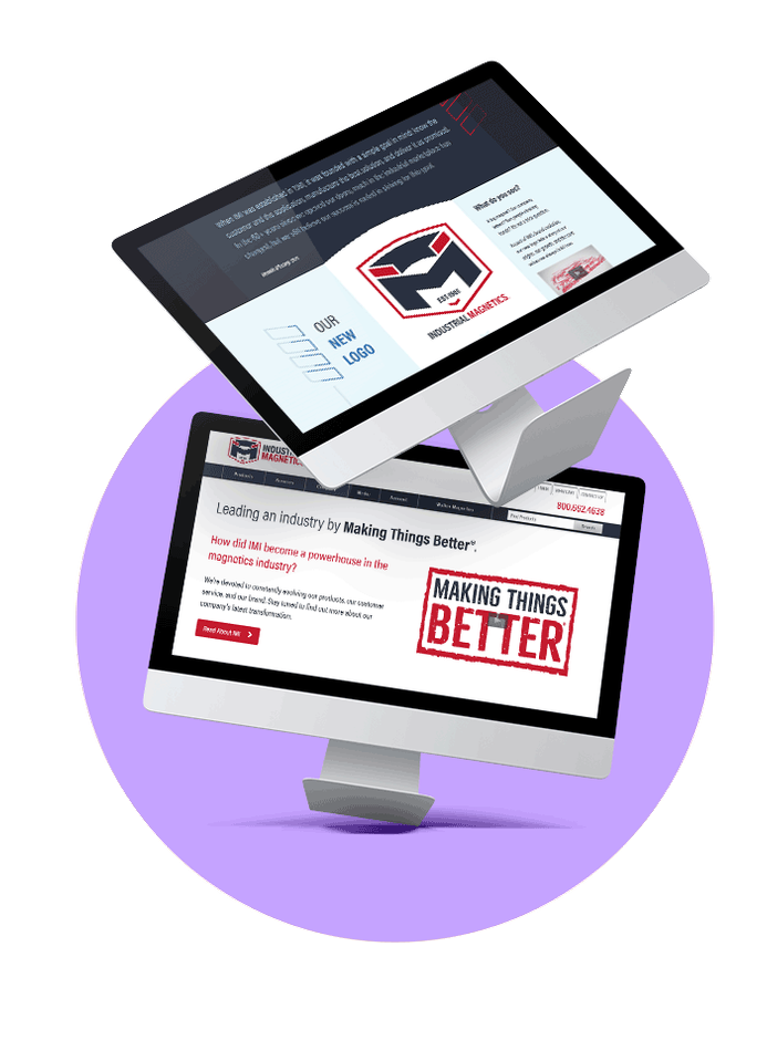
The rebrand represents IMI’s new direction with an impactful set of logos and icons, a strong colour palette, and clean typography. We supplemented their brand launch with a new About Us page explaining the journey behind their new logo, along with an unveiling video to showcase the visuals.
With guidelines to explain how different design elements should and shouldn’t be used, IMI can stay consistent with their new-and-improved brand.


